En
En Fr
Fr
A look at the colour grading tools used on “Madame Claude”
By Léo Hinstin, AFC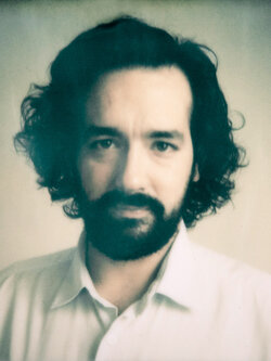
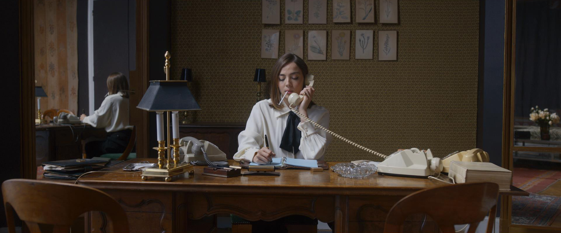
During preproduction, director Sylvie Verheyde and I defined photographic guidelines that were quite precise in terms of contrast and colour. After a couple of camera tests on set with the actors in costume and makeup, Gilles Granier and I were, at that early stage, able to suggest to Sylvie an already very well-defined look. In the colour grading room, based on the references that I had sent him prior, Gilles was quickly able to select from his personal library a Kodak film look from Photoshop whose characteristics were a match. He then retooled the look so that it would meet our aesthetic expectations, on one hand, and so that it would be compatible with ACES, on the other hand, so that the signal wouldn’t be "clipped" as might result from a classic LUT.
Le Labo recommends working within the ACES colour space, without requiring it. With just a few adjustments to his console, Gilles was able to assuage any doubts I might have had based on previous experiences. Once one understands what it’s all about, one simply has no further reason to hesitate. In the end, we developed a pretty dense and quite saturated look that Gilles turned into 3 different LUTs for on-set viewing, one for each effect : daytime interior, night interior, exterior.
In our handling of the dailies, we stuck to the principle that we should deliver images that would be very close to the final result. I was lucky to work with Delphine Penne, and then with Mickaël Commereuc, who split the work, and each of whom understood admirably well the intentions that Sylvie and I had.
As the look had been defined beforehand and since Sylvie really liked the image of the dailies, on the basis of which she’d edited the film, we were able to go into the colour grading process itself without the stress of having to come up with the look before beginning. Three weeks of colour grading enabled us to be very precise, to have back-and-forth discussions with the director, and to experiment. In short, to concentrate on the essential.
We found all of the settings from the dailies’ colour grading in Baselight when we began final colour grading, with the possibility of modifying them, since the colourists who’d worked on the dailies had used a set of LUTs that were specifically made to be compatible with the final colour grading process. That saved us a great deal of time because, on the vast majority of shots we had to colour grade, we’d kept those settings as our starting point. Often, we even reduced some of the values that we’d set during the dailies, particularly in order to reduce the contrast a bit, because Sylvie Verheyde likes a certain softness on the skin.
The use of tools developed in-house by Arnaud Caréo on Baselight enabled us to gain in speed and efficiency. These three tools are the Compress Gamut, the Gamut Shift, and the Gamut Transfer : they each have relatively similar code which was written when Le Labo was founded and is currently in its fourth version.
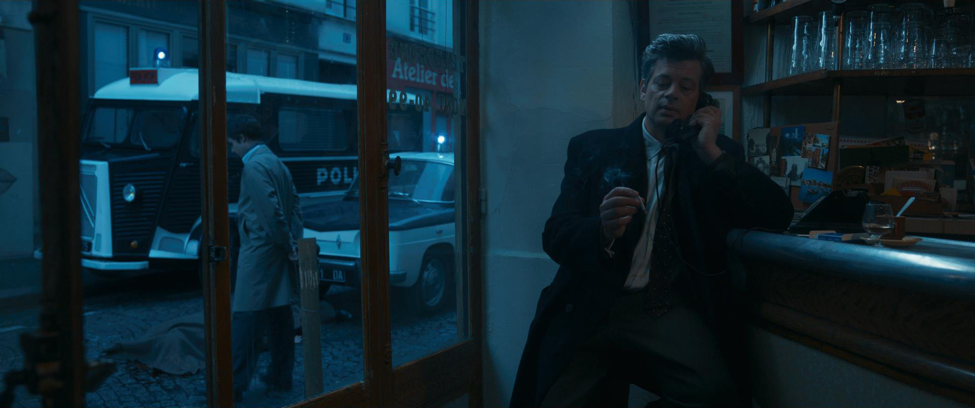
For example, we used the Compress Gamut tool to work on the ACES rendering of the Sony Venice’s greens, which have a well-known tendency to saturate. This tool allows you to define a colour (or a range of colour) and to reduce its scope within the colour space being used, which basically means asking it to be less coloured. When we came up with the look, this enabled us to apply a selective desaturation on a predefined range of greens to all shots, and thereby to gain mastery over the greens once and for all, since these tools are used at all stages of the process : final colour grading, grading of the dailies, and even in the LUTs for on-set viewing, since these particular settings can be incorporated into them, too.
As for the Gamut Transfer, this is a tool that allows you to redefine primary colours, or in other words, to indicate to the machine which colours you want it to consider as being primary. Once it has been applied, this tool enables you to change the settings directly in the way you want during colour grading, such that adding a bit of blue won’t just add a primary blue, but rather a bit of the blue that you’ve previously selected ! And so on and so forth for all colour-related settings.
Lastly, the Gamut Shift allows you to “remap” the white point (or any other point in the colour space). This indicates to the machine a point that it will thereby consider as the pivot point around which the colours in the colour space being used will now orbit, as well as bringing the colours towards this selected central point. One of its concrete uses is for working on saturations. The machine can be asked to desaturate low saturations without touching high saturations, for example.
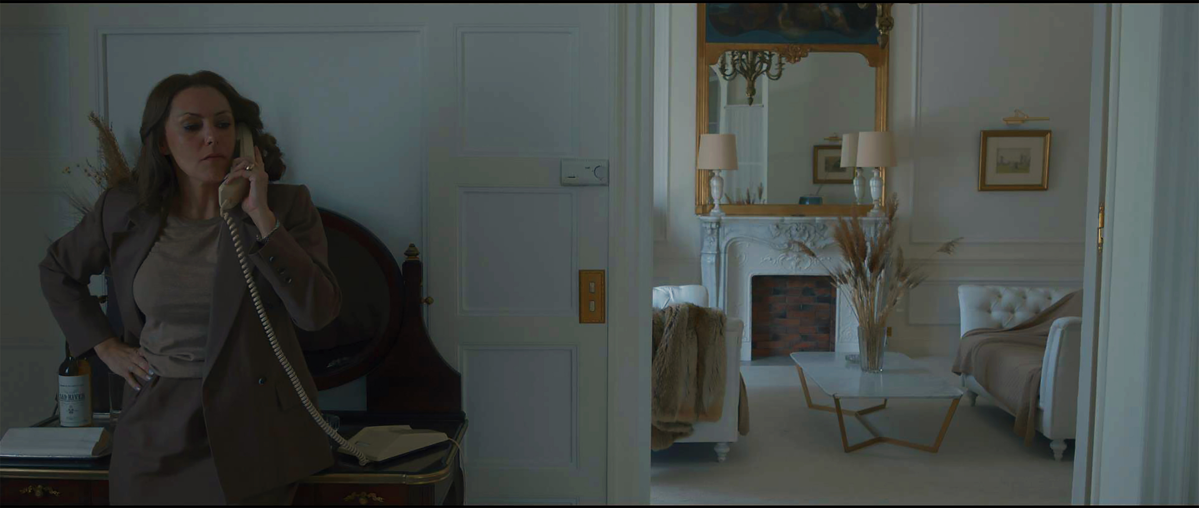
On Madame Claude, we used this tool for a sequence shot in the Bridal Suite of the Hôtel Raphaël, a spacious suite whose walls, carpet, fabrics and furniture are entirely white. Since this was a fragile location within a fully-operational hotel on a film with a limited budget, we could not really fully control the light coming in from the south-facing windows. When we went into colour grading, we wound up with different whites from one shot to the next, according to the camera angle, which were significant enough for us to feel we had to "clean" the walls. Of course, we could have done this shot-by-shot by keying in a chosen white and then desaturating it, but this would have taken time and we wouldn’t have been able to apply the same settings from one shot to the next, since there’s always the need to refine it, lest aberrations appear. By using Gamut Shift, this operation was performed in the blink of an eye on the entire sequence, since all we had to do was to ask the machine to desaturate the areas of low saturation (the whites) without touching the saturated areas (skins). The result was very natural and homogeneous.
Gamut Shift is a tool that was also designed to add look, for example, if you push it, you’ll get a result close to that of autochrome, a sort of "black and white in colour". The same goes for Compress Gamut and Gamut Transfer. Although these digital tools for Baselight were initially created in order to solve technical problems, Arnaud Caréo and the colourists working at Le Labo quickly realized the full creative potential they could get out of them. The idea was to make it easy to create very intense looks without having to key it in so they can be applied to LUTs.
- For more information on these tools you can watch the talk given by Arnaud Coréa, Fabien Napoli and Gilles Granier at the 2020 Journées de la Post-production organized by the AFC.
- Read or reread the interview with Léo Hinstin, about his work on the film, on TSF’s website.
Translated from French by A. Baron-Raiffe.