 En
En
 Fr
Fr“Transferts”: a sci-fi series made in France
Interview with cinematographer Pascal Lagriffoul, AFC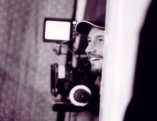
According to you, what makes this project different?
Pascal Lagriffoul: What makes it special, in my opinion, is that I get to work with a producer who is also the production designer, namely Patrick Benedek. The fact that he combines both roles made him enormously involved in the series, as he was its artistic producer, and that was highly motivating to us in all areas.
Like other made-for-television movies that I shot in the past with Patrick as my producer, Olivier Guignard was the director on this project, too. But this time, on the six episodes that comprise the first seasons, two episodes were given to a second director – Antoine Charreyron – who has a background in video games. He brought the world of graphics into the series. I was the DoP for the entire season so that it would have visual continuity…as per the vision of the two directors who, of course, often had rather different visions and approaches…
How did you translate their approaches?
PL: For example, Antoine had very precise requests as to the construction of the image. His precise vocabulary regarding lighting and framing came from terms used in computer graphics and weren’t at all the same as mine at first. I remember, for example, the term “Rimlight,” which is a 3D effect used to create shine on the characters’ skin. He also had an affinity for wide shots and very wide shots, compared to Oliver, and didn’t hesitate to play around with effects from the direction. I think that he must have been rather frustrated by the rhythm and limited possibilities of shooting a television series…
An example is that it is difficult to shoot forty shots a day, and to be precise and ambitious with each camera movement under “real” shooting conditions, which is very different from how creation works in the world of video games. His precision and his demandingness in the construction of shots and scenes caused me and others to stretch the limits of time and equipment, which made everyone’s ambition in this project a reality.
Olivier, on the other hand, is a director who pays close attention to the characters and the actors. His camera seeks out emotion and intimacy, it is close to the actors’ bodies and faces…not necessarily from far away. He has a great mastery of the production process, and an ability to adapt to the constraints and a desire to leave the camera and the actors room for inspiration, to have us “dance together” on set.
How did things go from one episode to the next?
PL: Most days were devoted to either one or the other segment, but there were a few exceptions that caused us to “cross board” the shooting schedules, with one director taking over from the other on the same set, sometimes during the same day. As often happens in made-for-television movies, we tried to reassure ourselves that they’d keep the same lighting axes so that we wouldn’t have to do everything over again when they changed over, and be able to “withstand” the day… Promises aren’t always kept…and we’ve got to make do! Whatever the case, I always try to place at least one important light source outside of the set, and I rely on that source or those sources, and in any case I wouldn’t have had the time to change their position for each shot.
You do both feature-length films and often work on TV fiction. According to you, what is the difference between these types of project?
PL: There are a number of differences, but I’ll mention the most concrete one. When you begin to work on a series, you’ve got to create a sort of visual reference bible (“mood board”) that will be used for preparation and shooting. At the end, I ask the people who are participating in the visual artistic proposal for the series to participate in colour timing at the beginning or at the end of the process. This is a more collective approach than on feature-length projects, which involves the artistic producer, the directors, and the chain (in this case, Odile Carrière, who is very involved and attentive to each step) in the fabrication of the image. What is motivating at the end, is that you get them all to work together to create a coherent artistic direction, that takes each individual’s ideas and opinions into account. Later on, each viewer will also be able to attribute his or her own meaning to it, as well. In a feature-length production, the image germinates inside of a dialogue between two people: the director and the cinematographer. Here, I had to find that thread in a multi-party discussion.
You mentioned the “mood board”… did you select other series as references?
PL: The British mini-series “Red Riding Trilogy” (2009) is one of my absolute models, and also, for the fantastic/sci-fi side, “The Leftovers”.
What were your main choices in terms of image?
PL: We had had the idea of a warm and sunny image that would be prevalent throughout the series. Well, we shot the series in Belgium, and that’s not the best spot for sunlight! Nonetheless, I tried to do as best I could with gold-coloured ambiences. I also tried to work a lot on complementary colours, sort of like playing on the contrast in a black-and-white film.
It’s true that from that point of view, when you film in black-and-white, you have a degree of control over the image that we’ve lost in colour. The colours mix or constantly fade if they’re not perfectly decided and coordinated. Unless you have the time and money to do very precise work on the sets, costumes, and lighting, it’s really hard to play that card.
Nonetheless, there are a few episodes, like the one with the pianist, that play on the association between blue and yellow, so as to strengthen the subplots. In our profession, the reality of budgetary constraints, time constraints, and directing constraints often severely put strain on the initial ideas!
What about the sets? Making a sci-fi world believable isn’t the least expensive thing!
PL: Although Brussels may not have been the sunniest of cities, we did, on the other hand, find its architectural hodgepodge to be quite ideal for translating the idea of contemporary futurism. From one street to the next, one easily go from the modern, to the 1950s, and then to the 1970s.
We chose to play the card of an ill-defined future, which is visually similar to the present, with just a few elements (such as the paucity of automobiles) that evoke the universe of science-fiction.
Few special effects in the end…but lots of ideas from the director.
What camera did you choose?
PL: The very intense shooting schedule (68 days for six 52-minute episodes) forced me to choose a flexible shoulder camera that could be set up quickly. We also wanted intimacy in the transferences. To be close to the actors and to have a shoulder camera that was designed as such and that brought a bit of uncertainty. One of the main characters who is transferred is a young girl, and so I shot at her eye-level, meaning the camera was just about at my waist. Since I don’t like working with suspended harness systems, such as the Easy Rig, I asked my grip team to create a mobile aluminium structure with an eyepiece (baptized “the cage” by the image team) that allowed me to feel as though I were working with a shoulder camera, but at hip-height.
What about the lenses?
PL: I usually work with a Cooke S4 series, because I’m familiar with them and I like their results. But given the high number of shots we had to shoot, and especially the time that it took to change lenses on my mobile cage, this time, I decided to also use three Angénieux ultra-light zoom lenses (15-40mm, 28-76mm, and 45-120mm) that I used a lot. After comparing them, it was impossible to tell the difference with the fixed series, except perhaps for a bit more flicker on the focus shifts. These were really invaluable tools for this project.
A word about colour grading?
PL: The work was performed in Belgium, at Studio l’Equipe, by Peter Bernaers, whose work was commendable. As I was explaining, I really like to decide on colours and contrast while shooting, and for me, colour grading isn’t about applying layers to the RED Raw files that overly-reconstruct the images. I expect the colour grader to bring out the image that already exists in the Raw rather than trying to create it afterwards. And that’s exactly how Peter Bernaers worked with me. It required a quick hand and a sure eye. I would like to attach a short text to this interview in which Peter will be able to explain the main points better than I could.
(Interview conducted by François Reumont on behalf of the AFC, and translated from French by Alexander Baron-Raiffe)
- Read the text by Peter Bernaers on colour grading for the series “Transferts”.
Production: Patrick Benedek for Arte France (Odile Carrière)
Screenplay: Patrick Benedek and Claude Scasso
Directors: Antoine Charreyron and Olivier Guignard


